Making graphs

The software also allows you to make a graph by varying a variable and measuring the output at a given point.
Example
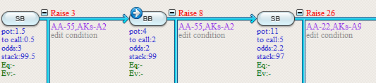
Let's have a look at an example of making a graph by examining how changing BB's raise size will affect his EV.In order to do this, we'll need to give the software two pieces of information:
1) What quantity needs to be varied?
2) Where does the output need to be measured?
1) What quantity needs to be varied?
In the previous section we have just attached variable #1 to BB's raise size.
For this example, we'll use thát variable as the variable that we'll vary for our graph.
The software will need to know where to measure the output.
To instruct the software to measure the output at BB's raise decision we need to set a checkpoint there.
In order to do so:
- Press F10 (or click the  symbol in the toolbar)
- Click on BB's decision node
The checkpoint symbol will now be drawn over the decision node:
Making the graph
Press the graph icon (see icon at the top of this page) or press F8.
Select "Vary one variable".
Now vary variable #1 from 6 to 14 with a step of 2 and measure the output in EV.
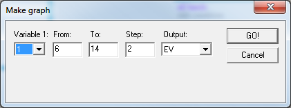
Press GO! and your graph will be created.
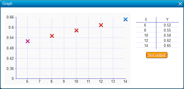
The output will also be shown as a table.
If you press the Text output button you'll get a dialog that allows you to copy paste the output to, for example, Excel.
| << Previous | Contents | Next >> |